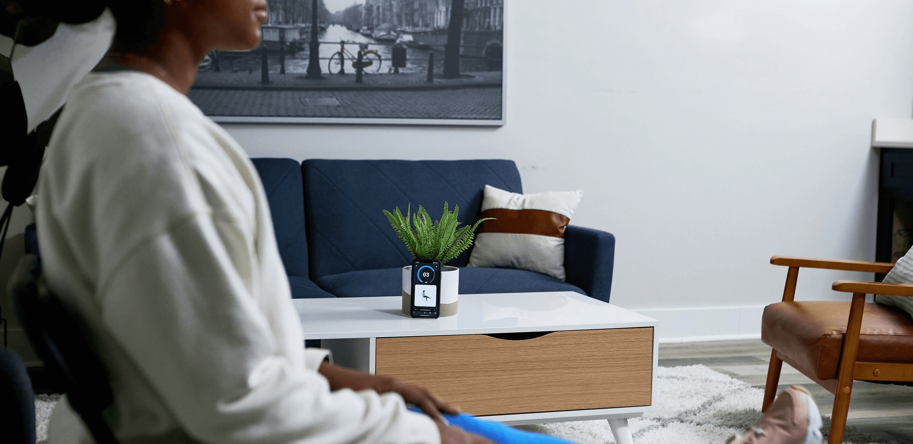
Mobile Rollout
Year
2022
Client
IncludeHealth
Industry
Healthcare
Role
Product Designer
The Mobile Rollout for IncludeHealth represented a pivotal evolution in our platform’s accessibility. Prior to this initiative, IncludeHealth was only accessible via desktops, laptops, and tablets. With the goal of broadening our user base and enhancing user convenience, this rollout aimed to introduce mobile access and refine the UI on existing views.
Role & Responsibilities
As Product Designer and Squad Lead for this project, my role spanned from the initial wire-framing phase, prototyping, feedback collection and analysis, to finalizing the UI design. I worked hand-in-hand with quality assurance to ensure that every view adhered to our rigorous standards. Another responsibility of mine was building bridges between departments to harmonize our visions and drive the project's objectives to fruition.
Wireframe Creation
Prototyping
Feedback Analysis & Dissemination
UI Design
Quality Assurance
Squad Lead
Existing Pain Points
Exclusion of Mobile Phones
The first deployments of the IncludeHealth platform did not allow mobile phone access. Having recognized areas that were non-responsive and suboptimal for mobile usage, mobile phones were intentionally left out, sidelining a significant portion of potential users.
Previous Mobile Gate
Distant Viewing on Small Screens
Regardless of device, users would typically need to position themselves 6-8 feet away from the screen to ensure their whole body was captured by the camera. This configuration was appropriate for larger screens, but when setting about mobile device integration, it was clear that the legibility challenges posed by such a distance on smaller screens needed addressing.
Performance Screen on mobile w/ no adjustments
Inconsistent Survey Presentation
Historically, IncludeHealth’s surveys were bespoke in design, resulting in an intensive process whenever new surveys were added or modifications were needed. A shift towards a standardized survey design was essential to simplify integration and maintain a unified user experience.
Example of the differences between Surveys
Goals
In order to ensure that this work was successful, we went about setting three goals for the Mobile Rollout.
01
Reshape the platform for comprehensive responsiveness, emphasizing mobile users.
02
Implement features that amplify user convenience, like SMS-driven login codes and timely reminders.
03
Transition the platform's surveys to a unified, standardized template, ensuring ease of future survey integration.
The Approach
Stakeholder Collaboration
As the Squad Leader, I was at the helm of fostering collaborations across all facets of the company — from Product and Business to Engineering. This inclusivity was crucial to ensure that every voice was heard, and the project's requirements were holistically addressed. In order to guarantee success, we needed a unified vision.
Design & Development
The process was initiated by exhaustively detailing the current workflows. Modifications were made to ensure a consistent user experience across platforms. Research insights about legibility standards greatly influenced our initial design sketches. An iterative design approach culminated in the creation of new type scales and spacing variables, propelling the platform's responsive attributes.

Patient Workflow documentation
Educational Approach
The rollout was combined with strategic educational outreach. We equipped Physical Therapists with essential information about the new mobile features. Alongside this, we produced easy-to-follow printed guides for both the therapists and their clients. The positive feedback we received from both groups was a clear sign of success. Their excitement and increased use of the platform showed that our approach worked well.
Example of collateral created to introduce mobile
The Redesign
Old Login Screen VS new Login Screen
Old Activity Overview Screen VS new Activity Overview Screen
Old Setup Screen VS new Setup Screen
Tablet Performance Screen VS mobile Performance Screen
Tablet and mobile Performance Screens for new Non-Tracked Activities (no camera)
Tablet and mobile Instruction Screens for new Non-Tracked Activities (no camera)
New standardized Survey layout
These screens fell out of scope, to be done in a follow-up pitch
Results
The Mobile Rollout for IncludeHealth was a clear demonstration of our unwavering commitment to user-focused design, careful planning, and continuous innovation. The feedback we received was overwhelmingly positive, leading to a noticeable uptick in user engagement and adherence. Clinicians and patients alike responded with great enthusiasm to the introduction of mobile support, underscoring the success of our project and reinforcing our belief in its importance.
Lessons Learned
Adapting Dense Content for Mobile Viewing
Mobile screens, especially when viewed from a distance, posed a unique challenge. The regular size and density of on-screen text became a hurdle for user comprehension.
Web-App Versus Native App Decision
Our primary user base, Medicare patients, displayed challenges in navigating native apps. Issues like locating the app store and consistent app launching posed significant barriers.
Time Constraints and Design Consistency
While the project had ambitious goals, time constraints inevitably arose. Certain legacy views and styles remained due to these limitations, potentially affecting the uniformity of the user experience.
Voice-Over Potential
The power of voiceover guidance, especially in guiding users through tracked and non-tracked (camera off) exercises, became evident during the project's journey.

Designed & Built by Brady Jacobsen
©2023


